Winelands Dentistry
Winelands Dentistry aims to provide a reputable dental group practice where staff want to work and patients want to tell their friends and family about.
Brand Values
REPUTABLE
AUTHENTIC
DISTINCTIVE
SERENE
COMPASSIONATE
Target Market
Individuals who seek long-term dental solutions, understand and value realistic treatments, looking for quality, and a positive experience.
Moodboard
01 COLOURS AND MOOD: We want your content to have a serene and proffessional feel. The colours are muted which gives a soft and dependable look. We picked colours that feel modern for a fresh look that stands out against your competitors.
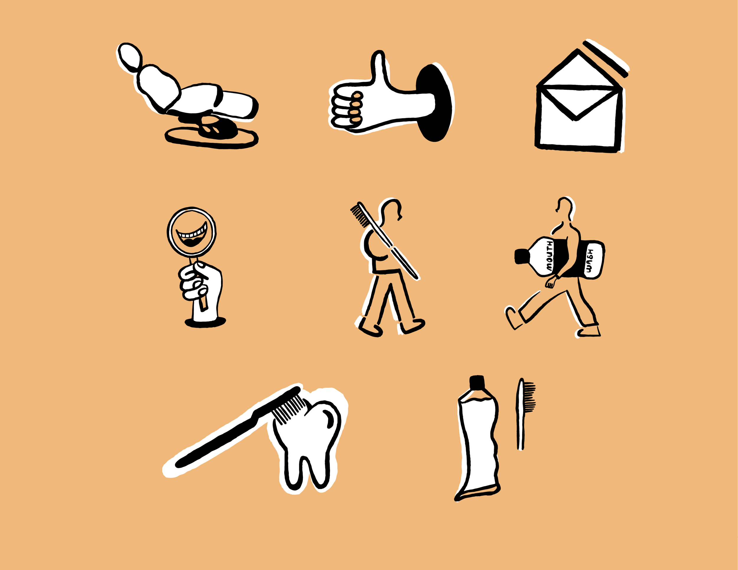
02 ILLUSTRATION: Inspired by simplistic, solid-shaped illustrations, that contrast well with a more detailed typeface. This flat design lends itself to create recognizable imagery associated with dentistry, making branding cohesive and clear.
03 TYPOGRAPHY: A more detailed and modern serif typeface notonly contrasts well with the simplistic illustrative style, but also feels welcoming and attentive.
04 DESIGN: We want your brand to feel as fresh as clean teeth and as welcoming as a bright smile. We hope to achieve this by making your branding feel new to contemporary dentistry branding yet familiar enough to be inviting for your existing audience.
Colour Palette
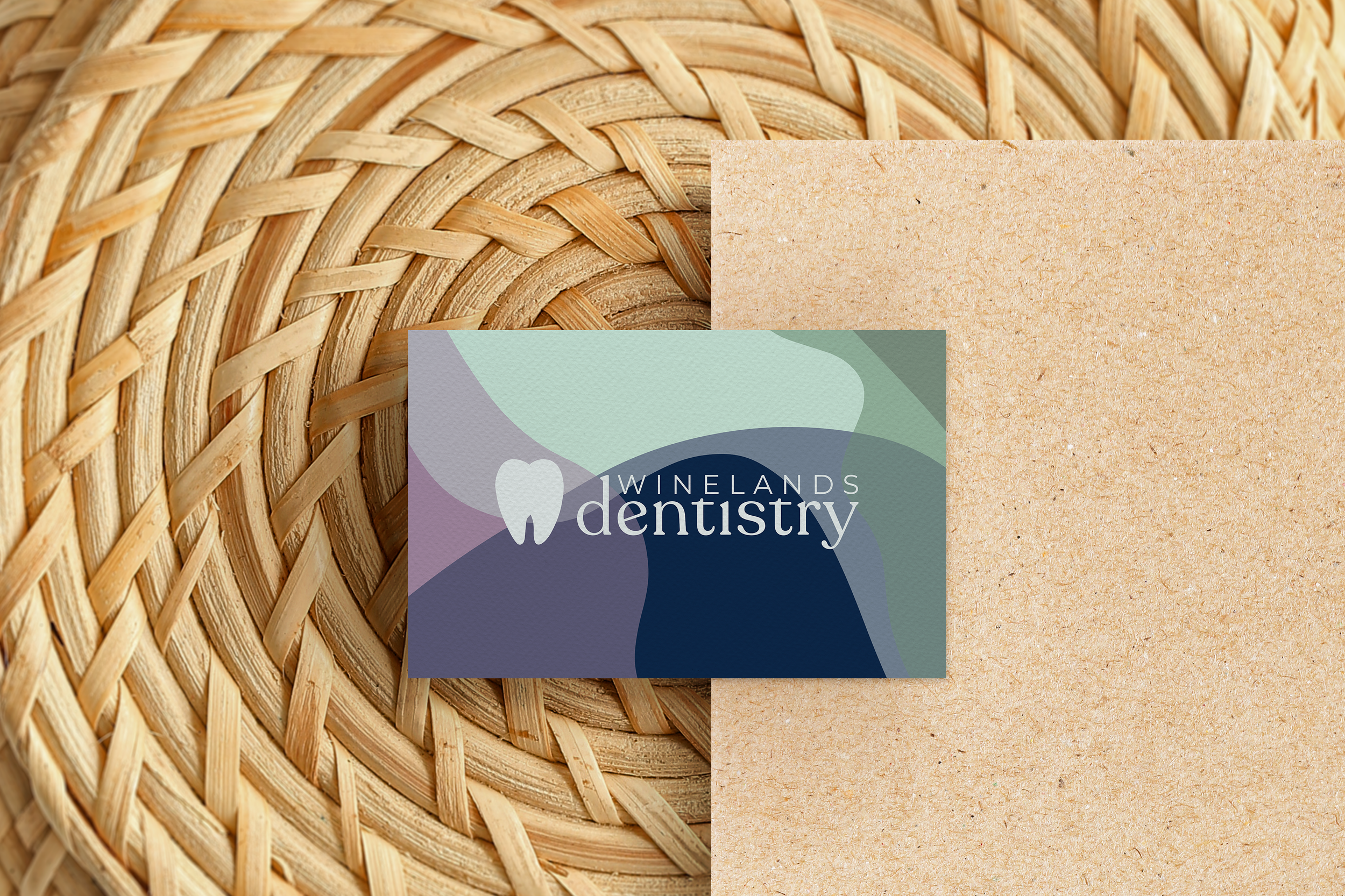
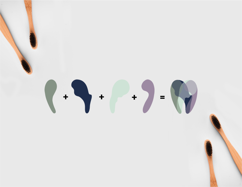
A versatile colour palette inspired by feelings of serenity, dentistry and being authentic! A soothing green sage, a steadfast stone grey, and a deep sea blue. Modern mauve (purple) represents the distinctiveness of your business, bringing a unique twist while also being cohesive to your brand. The fresh mint colour represents, well, tooth paste and cleanliness. Simultaneously, the sunrise peach acts as an accent colour of warmth, that represents the welcoming sunrise of a new day.
Primary Logo
Horizontal Logo
Stacked Logo


